

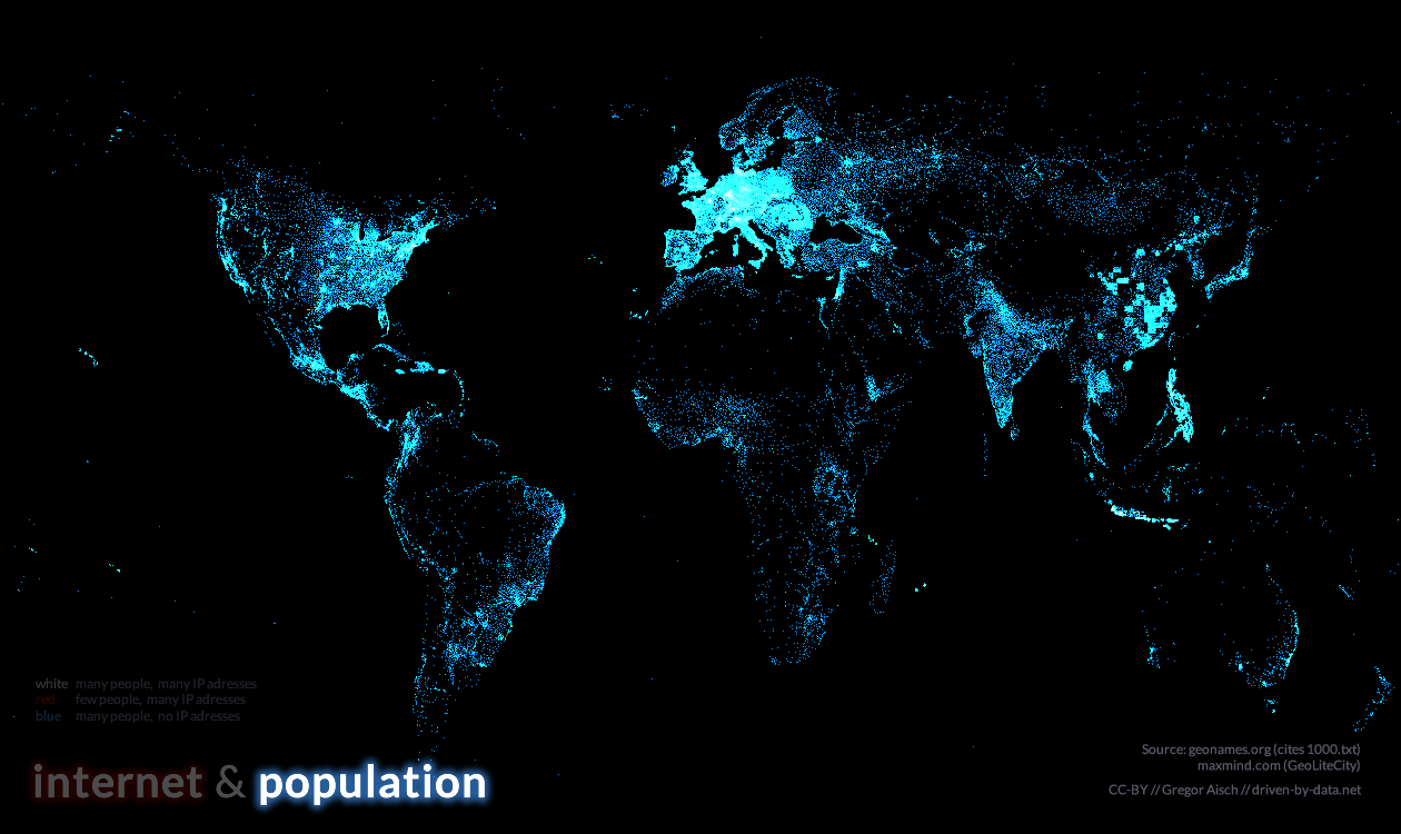
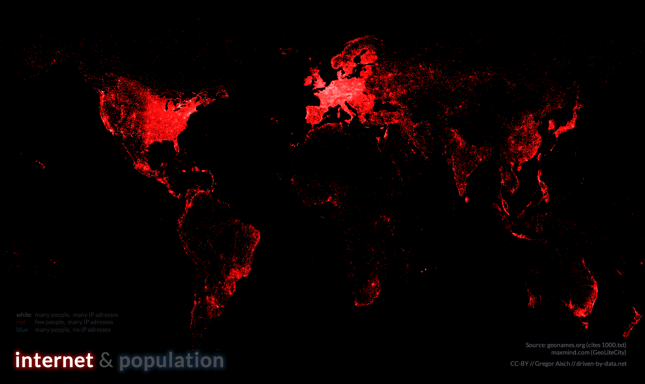
It shows more than 80,000 populated places in blue and about 350,000 locations of IP addresses in red.
White dots indicate places where many people live and many IP addresses are available.
The IP address locations are taken from the GeoLiteCity database by MaxMind.
The database of populated places is taken from geonames.org. The visual style is largely inspired by Eric Fischer's wonderful Flickr-vs-Twitter maps.
Also, here you can find a high resolution version and the separate layers for population and internet addresses.


No comments:
Post a Comment